Case Study: How We Feel
User research and insights on personal health data sharing for the public good

The How We Feel app (HWF) was developed in March 2020 by an independent, non-profit organization called The How We Feel Project. The app requires users to self-report their age, sex, ZIP code, and health conditions, including COVID-19 symptoms. The aggregated data is securely shared with select scientists, researchers, and public health professionals who are actively working to help slow the spread of COVID-19.
Right from the start, I found the app extremely fascinating, from its purpose to its world-renowned development teams, to its appealing UI and UX designs. My interest prompted me to do further user research because I believed that the app had much broader potential for other uses while staying true to its primary focus and promise that aggregated data would make the world healthier by connecting citizens with the global health community. On the other hand, I was curious to understand how users really feel about sharing their personal health information for the public good.
Setting up the project plan
I started ambitiously by setting my goals to test five hypotheses while assessing how users perceived the current app design. These objectives informed my process and methodology.

Identifying user types
For the scope of this research, I chose to include only users who lived in the US and focused on the following two user types:
Health Enthusiasts (Data loggers/Journal keepers)
- General users or individuals who contribute their data to the app.
- These users will sign up (optional), answer survey questions, and look at their data recorded over time. The users may look at data collected within their communities or other user groups. They may also set up to be notified to log their data daily.
- I interviewed three participants for this user type.
Health Experts (Data analysts/Researchers)
- Individuals or organizations who are interested in seeing the aggregated data from various population groups.
- These users will sign up (required), search, filter, and review the relevant information. These users may also contribute new insights or ideas on how data should be collected and utilized meaningfully.
- I interviewed an additional of three participants for this user type.
Note: All names of the participants are fictional names.
Synthesizing interview findings
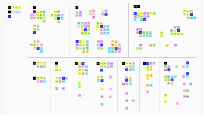
All six user interviews were incredibly insightful to help me assess my hypotheses, generate on-point user personas, and understand how several key design features of the current app were perceived. I used Mural to help me organize and synthesize my findings.

User’s insights vs. hypotheses
Below are my five hypotheses and the findings from the research. It was very intriguing to me to find that I was right about some of my assumptions. On the other hand, I was entirely wrong in a few areas.
First hypothesis
With the spread COVID-19 and the increased awareness around better public health through personal data collection, more users are likely to believe that it’s beneficial to share their personal health data through credible digital mobile apps (such as the How We Feel app), and feel comfortable doing so.
Findings:
- Interview results have confirmed this hypothesis.
- While each participant had different views and comfort levels on sharing personal health information, all participants in both of the user groups believed that it’s essential to the public health to share personal health information, especially during the current COVID-19 crisis, in order to help manage the pandemic.
- Trusted and well-known non-profit organizations were seen as a crucial criterion for the participant’s peace of mind. Interestingly, most participants did not want to share their information to for-profit organizations or businesses, even if the data would be used for the public good.
Second hypothesis
The mind and the body are connected. Therefore, information related to both physical and emotional states must be evaluated together to better understand one’s health and our community’s health.
Findings:
- Interview results have proven that this was a partially correct assumption.
- All participants believed that the mind and the body were extremely connected: an avg score of 4.83, with 1 being not connected at all and 5 being extremely connected.

- While all participants recognized the benefits of tracking both physical and emotional health data, their current behaviors were primarily driven by specific personal goals to track only either the physical or emotional health state — instead of monitoring both. Many participants did not track their emotional health data because they did not think they needed to monitor their emotional wellbeing.
- Additionally, some participants stopped tracking specific physical or emotional health data after they believed they’d reached their goals or that the particular app was not user-friendly or limited in features.
- There was mixed feedback on the benefit to our community’s health. The organizations in charge (i.e., for-profit vs. non-profit) and the process of data collection are critical factors in determining the community’s health benefits.
Third hypothesis
Exposure to the user’s daily physical and emotional information recorded over time would make the user become more health-conscious, empowering the user to take better care of his/her health.
Findings:
- Interview results have confirmed this hypothesis.
- The ability to track and see trends over time was one of the strongest motivators for all participants to use health data tracking apps.
- All participants felt strongly about being able to access helpful resources (e.g., training sessions, exercises, expert advice, etc.). These resources were seen as highly beneficial and were a tremendous driver for the users to continue using the apps regularly and for the long term.
Fourth hypothesis
Exposure to the community’s physical and emotional health information, including those populations around the user, would make the user more aware of the general public health trends, which could instill a sense of caring and empathy toward his/her communities or lead to other meaningful outcomes.
Findings:
- Interview results have proven that this was mostly a wrong assumption.
- All participants acknowledged the benefit of contributing their data to the public health and believed that it could lead to meaningful outcomes. However, seeing the community’s health data did not seem to instill a sense of caring and empathy toward their communities among the majority of participants. On the contrary, seeing this data could lead to other undesirable outcomes such as self-reporting bias and data misinterpretation issues.
- When asked further about data of different sample sizes, none of the participants was interested in seeing aggregated data representing small groups of people, such as friends, co-workers, residents in the same apartment building, or people living in the same block. The smallest size of the population that still allowed the participants to feel comfortable sharing data without fear of tracing was by zip code, and not any sizes smaller than that.
Fifth hypothesis
Aggregated data would serve as a powerful new tool for scientists, doctors, and public health professionals to identify potential populations that could be at risk and save lives, whether by fighting against the next pandemic or improving our mental health.
Findings:
- Interview results have confirmed this hypothesis is a correct assumption regarding the current COVID-19 pandemic. For future pandemics or other health crises, only two of six participants (one from each group) were asked about this topic. Both of them strongly supported the idea. However, the prevalent recurring concerns include user engagement, continued usage of the app, data security, and user’s privacy protection.
In conclusion, even though some of the hypotheses were proven wrong, the overall findings still present the HWF app, including its current and potential future features, as a very appealing product to all interview participants.
User persona synthesis
All of the six user interviews led to incredibly informative and insightful results that help me generate strong user personas. I recognized two distinct personas within the Health Enthusiasts group. There were many different facets between them, from motivations to pain points, to their interests, or lack thereof, in seeing how people around them feel. So, I decided to create two personas for this user group and one persona for the Health Experts group. Here are the three user personas:
Health Enthusiast User Personas
Health Expert User Persona
Key findings on the current app design
To further understand the user’s perceptions of the HWF app, I included several key screens in my interviews. The majority of users responded very well to both the content (the research’s primary focus) and the overall UI and UX designs (the secondary focus). All participants provided several useful observations and suggestions for areas of improvement.
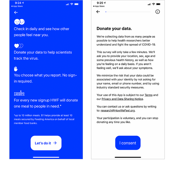
1. Assessing “Donate your data” concept

- The idea of “Donate your data” was incredibly well-received as it suggested doing something good.
- The content was clear and not too lengthy, but more emphasis may be placed on the user’s privacy protection policy.
2. Assessing “How are you feeling today?” screen

- The simplicity and straightforwardness of this screen were well-received.
- Many participants suggested that it would be clearer to modify the question or separate the answers into two sections: one for physical and one for emotional health.
3. Assessing the screen for inputting symptoms

- Five of six participants thought the list was too long, especially for users who might not be feeling well or were experiencing COVID-19 symptoms. On the other hand, one Health Expert suggested adding a feature to report symptoms not listed, so that researchers can gather data of less commonly known symptoms.
- Many participants wanted the list to be more clearly organized and not contain more than 15–18 line items. The most preferred way was by listing the most common symptoms at the top. The feature to input symptoms not listed could be added at the bottom of the list.
4. Assessing the screen for inputting feelings

- The list, its interactivity, and its engaging visual design were well-liked by the majority of users.
- A few suggestions for improvement included grouping emotions that use the same color together and increasing legibility of text (e.g., the black text on a blue background was very hard to read).
5. Assessing “How you feel emotionally” infographics

- The infographics were very well-liked by all participants.
- Areas of improvement included revisiting the bar graphs underneath the heart, ensuring the user’s inputs and data representations were better matched, or more details were provided to help understand the bar charts in relation to the heart graphic above.
6. Assessing “How people feel in your county” screen

- Only one of three participants from the Health Enthusiasts group was interested in seeing this data. The other two participants saw no personal benefits nor had any interest in seeing this data.
- More importantly, additional feedback included self-reporting bias and data accuracy concerns. For example, one participant stated that seeing the results could influence his/her answer in the next survey because he/she wanted to belong in the “feeling well” group, which was the majority group, even though he/she might not be feeling well at the time. Another Health Expert cautioned that users might have a fault sense of security by seeing that most people from their area were feeling well compared to the much smaller number of those who were not feeling well, even though the total sample sizes from both groups might be too small to provide any credible conclusions. This misperception could result in users becoming more careless, which could cause more harm to public health.
- A zip code level is the smallest area that most participants felt comfortable having the data represented. In contrast, one Health Expert believed that “by county” was the right way to show the information because people traveled across towns. So, data based on one city or zip code might not be as useful.
- Age and sex were seen as beneficial data points by the Health Experts group. However, the data must be collected in a way that cannot lead to a particular user being easily traceable (i.e., a 90-yr-old woman from a specific zip code could be very easily identifiable).
- While data on user’s weights may be useful, some Health Experts cautioned that most users did not know their weights, resulting in inaccurate information being collected.
Understanding the competitive landscape
Four competitors were assessed using SWOT metrics (Strengths, Weaknesses, Opportunities, and Threats). The competitive analysis revealed no direct, imminent competitors to the How We Feel app.

HealthLynked COVID-19 Tracker and Healthy Together
- Both products have some unique features differentiating from the How We Feel app. However, overall, both of them do not outperform or offer more benefits to users.
- The most differentiating feature of the HealthLynked COVID-19 tracker app is the interactive world map that can be zoomed in to see data at a local level.
- In contrast, the most differentiating feature of the Healthy Together app is its immediate, action-oriented result telling users if they need to get tested or not after completing the daily survey.
Fitbit
- Fitbit has the most potential to become a threat because of its well-established, massive user base and resources, but the app doesn’t seem to put much emphasis on COVID-19 tracking, especially for the public good. Nonetheless, Fitbit recently announced a new solution, Fitbit Care Ready for work, a product built specifically for B2B aiming to help employees make informed decisions about returning to the workplace.
- The most interesting feature of Fitbit is the free resources tailored to COVID-19 situations (e.g., healthy indoor habits, virtual doctor access, etc.)
Reflectly
- Reflectly is the only app within this analysis that helps track emotional wellbeing. However, Reflectly is solely focused on a daily journal and personalized interactions with its promoted Artificial Intelligence (AI). While Reflectly is not a current direct competitor because it offers very distinct purposes and benefits from the How We Feel app, some users might choose to use only one of the two apps — instead of using both.
- The most exciting feature of the Reflectly app is its intelligent interactions, questions, and guidance, driven by AI.
See here for more details of the competitive analysis.
Epics and user stories
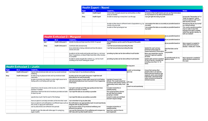
To help inform how the current HWF app can be improved, especially in the ideation and prototype phase, three epics with multiple corresponding user stories were created to capture the features and functional needs based on the analysis specific to each of the user personas.

Conclusion
This user research project has revealed many user’s insights that can help guide the next iteration of the How We Feel app. I believe that this knowledge can also be applied to other similar apps either to help manage the current COVID-19 pandemic or to help mitigate future public health crises.
While the promise of “donating your data” or doing something good for the public health was extremely appealing to all users, the most significant challenges remain to be how to get more users to sign up, keep them engaged, and continue using the app for the long term. To solve these issues, we must look deeper and understand each user’s unique behaviors, motivations, and pain points at a personal level, and develop an app that can meet all of the following criteria:
- Can seamlessly and effortlessly be integrated with the user’s daily activities. Consider providing access across platforms, multiple ways to set up daily notifications (e.g., via push notifications, text, email, etc.), and the ability to sync with other apps (e.g., Apple Health, etc.) per the user’s preferences.
- Provide helpful and informative resources that can directly impact the user’s health. The research showed that the user’s desire to reach their personal goals could be a powerful, long-term motivator.
- Ensure that the user’s personal health information will be protected and only be used by trusted, non-profit organizations and for the public good.
- Hold the user’s attention. Routines can be tedious. The competitive analysis revealed that the use of AI could be one of the many ways to build smart, engaging, and enjoyable interactions between the user and the app.
- Gain traction and reach a large pool of populations, so that the data collected can be statistically significant and meaningful.
Thank you
If you have any questions or feedback, I’d love to hear.

